What Exactly is the Light Summer Color Palette?
To truly master your wardrobe, you need to understand the underlying science of your season. Color analysis is not arbitrary; it is based on three specific dimensions of color. Let's break down exactly what makes the light summer color palette unique.
The Color Dimensions: Hue, Value, and Chroma
If you've ever wondered why a trendy camel coat makes you look exhausted or why a warm beige sweater makes your skin look almost "dirty," the answer lies in your color dimensions. A Light Summer must meet three specific criteria simultaneously:
- Hue (Cool / Cool-Neutral): Your undertones are cool. You thrive in colors that have a blue or pink base rather than a yellow or golden one. This is exactly why warm colors—like orange, mustard yellow, and golden brown—create a "muddy" effect on your complexion, leading to what analysts call "warmth pollution."
- Value (High / Light): This is your dominant characteristic. Your overall coloring is very light, with very little darkness or depth in your natural features. Therefore, colors with a high white content (lightness) complement you, while very dark, heavy colors will severely overpower you.
- Chroma (Low to Medium / Soft): Your colors are muted, not bright. A Light Summer has a delicate, dusty quality to their coloring. If you wear highly saturated, neon, or vibrant colors, clothes will enter the room before you do—they will "eat" your features and leave you looking washed out.
The Universal Light Summer Color Card
So, what does this look like in practice? Imagine a watercolor painting or a beautiful, frosty morning. The best colors for this season are essentially "cool pastels"—they are light, icy, and slightly muted with a drop of grey.
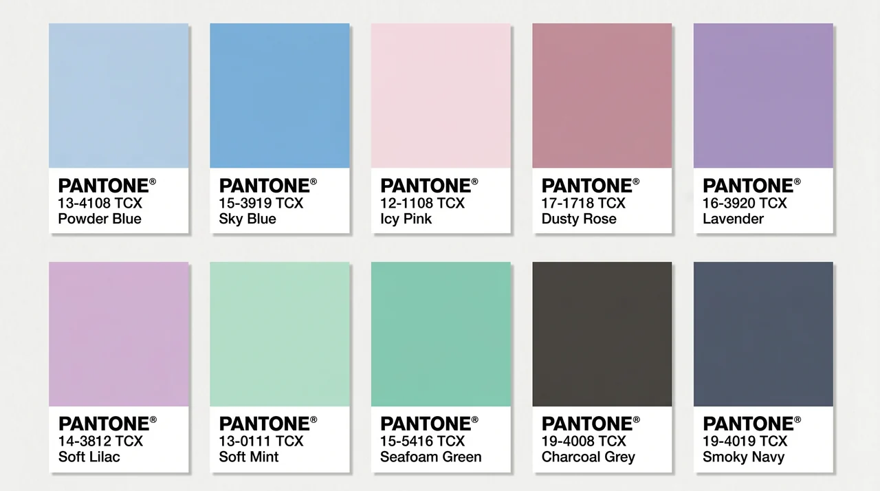
If you were to build a foundational color card, your most classic and universally flattering swatches would include:
- Powder Blue & Sky Blue: Refreshing, airy, and incredibly harmonizing.
- Icy Pink & Dusty Rose: Cool-toned pinks that bring a natural, healthy flush to your cheeks.
- Lavender & Soft Lilac: The ultimate sophisticated purples for a cool undertone.
- Soft Mint & Seafoam Green: Delicate greens that lack any harsh yellow undertones.
- Charcoal Grey & Smoky Navy: Your best neutral alternatives to stark, heavy black.
Why Do Palettes Look Different Online?
If you have ever searched for your palette on Pinterest or Reddit, you have probably run into a major frustration: every website seems to show a slightly different set of colors! Some palettes look very pink and pastel, others look incredibly grey and muted, and some even feature surprisingly bright blues.
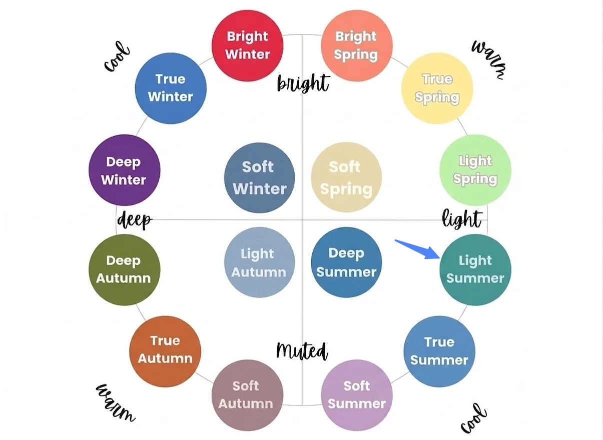
This causes massive confusion, but it isn't because color analysis is a hoax. It happens because of "boundary drift." The Light Summer season sits exactly between True Summer (which is very cool) and Light Spring (which is very light). Because it is a transitional season in the 16-season system, it borrows the coolness from Summer and the lightness from Spring. Depending on which system a blogger is using, the palette might lean slightly warmer and brighter, or cooler and softer.
Light Summer Color Palette vs Soft Summer and Light Spring
Because of this "boundary drift," it is incredibly common for people to confuse Light Summer with its neighboring "sister seasons." Many users frequently search for the light summer color palette vs soft summer to figure out why they can wear some dusty colors but not others.
Are you borrowing colors from a neighboring palette? Use this straightforward comparison table to pinpoint exactly where you fall on the spectrum:
| Season | Dominant Trait | Secondary Trait | Best Colors | Worst Colors to Avoid | Overall Vibe |
|---|---|---|---|---|---|
| Light Summer | Light (High Value) | Cool (Blue undertones) | Icy pink, powder blue, soft lavender | Dark, heavy, and warm colors (e.g., rust, chocolate) | Ethereal, clean, delicate, and refreshing |
| Soft Summer | Muted (Low Chroma) | Cool (Blue undertones) | Dusty mauve, sage green, rose brown | Bright, neon, and highly saturated colors | Elegant, smoky, sophisticated, and understated |
| Light Spring | Light (High Value) | Warm (Yellow undertones) | Peach, warm aqua, buttercream yellow | Dark, heavy, and overly cool/icy colors | Fresh, lively, luminous, and sunny |
Pro Tip: If you find that dusty mauve (a Soft Summer favorite) makes you look a bit dull, but powder blue makes your eyes pop, you are definitely a true Light Summer. If the peach looks fantastic on you but icy pink drains you, you might actually lean towards Light Spring.
Light Summer Color Palette Clothing and Wardrobe Guide
When it comes to building a wardrobe, the transition can feel overwhelming. Navigating light summer color palette fashion often requires a mindset shift, especially if you are used to relying on high-contrast staples. Let's tackle your biggest styling challenges and transform your closet.
The Ultimate Dilemma: Can I Still Wear Black?
This is, without a doubt, the number one question asked by newly typed Light Summers. If you love a minimalist, edgy, or gothic aesthetic, being told that black is "too heavy" or "too harsh" for you can feel like a fashionable death sentence.
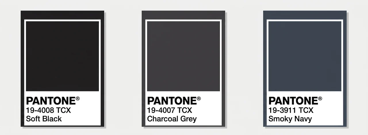
Let's be realistic: black is not your optimal color, but it is certainly not forbidden. The trick is how you wear it. To minimize the harshness, keep true black away from your face (think trousers, skirts, or shoes). For tops, coats, and dresses close to your neckline, pivot to your season's "dark" neutrals.
Soft black, charcoal grey, and smoky navy are your best friends. They provide the same sleek, chic vibe as stark black but harmonize beautifully with your delicate coloring. In fact, many users in color analysis communities have successfully adopted trends like "ethereal goth" or "cool-toned minimalism"—achieving that edgy, mysterious look without the draining, aging effect of pitch black against their skin.
From "Boring" to Expensive: Mastering Quiet Luxury
Another major complaint is that this palette feels "too plain," "lacking presence," or even "like a little girl's bedroom." If you thrive on sharp tailoring, bold contrast, or a dramatic aesthetic, pastel tones might feel deeply uninspiring.
The secret to elevating light summer color palette outfits is realizing that your power doesn't come from loud, dramatic contrast; it comes from looking clean, refined, and effortlessly expensive. You are the absolute master of the "Quiet Luxury" aesthetic.
To make your soft colors look incredibly chic, focus on:
- Monochrome Layering: Wearing tonal shades of icy blue or soft grey from head to toe creates a striking, elongated silhouette.
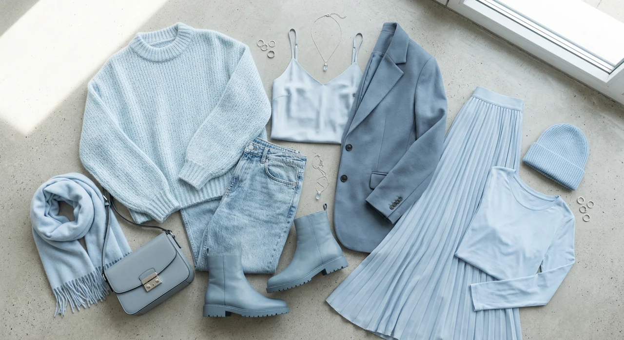
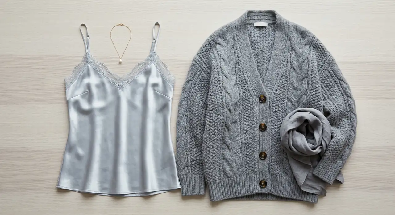
- Mixing Textures: Since you lack contrast in color, create contrast in fabrics. Pair an icy, reflective silk camisole with a matte, chunky cashmere cardigan. This adds incredible depth and sophistication to your look, proving that soft does not mean boring.
Shopping for Your Season in Autumn and Winter
Finding light summer color palette clothing in the spring is easy. But the moment autumn hits, retail stores are suddenly flooded with camel, rust, olive green, and chocolate brown—all of which are your worst enemies (hello, warmth pollution!).
How do you survive winter shopping?
First, focus on building a strict capsule wardrobe centered around your cool neutrals (icy white, blue-grey, and navy) so you aren't at the mercy of seasonal retail trends. Secondly, look outside of mainstream Western fast fashion. Scandinavian minimalist brands and Korean fashion labels are famous for producing soft, cool-toned, low-contrast garments year-round, making them a treasure trove for your seasonal needs.
Still can't quite picture yourself swapping your go-to black for charcoal grey? We completely get it! Just toss a quick selfie into our AI Outfit Generator, and you will get the answer.
The Great Jewelry Debate: Are You Restricted to Silver?
Once your wardrobe is sorted, jewelry is the crucial finishing touch. Traditional color analysis rules heavily dictate that cool seasons must wear silver. But realistically, high-shine sterling silver can sometimes look too stark and sharp against the soft, delicate fabrics of a Light Summer wardrobe.
Instead of treating "wear silver" as a rigid law, here is exactly how to navigate metals and accessories for your specific season:
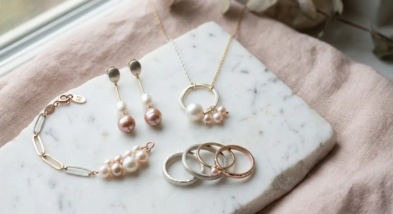
- Opt for Matte over Shine: Because your coloring is soft (low chroma), highly reflective metals can overpower you. Brushed silver or matte white gold blends seamlessly with your skin tone, looking incredibly expensive and intentional.
- The Right Pearls: Pearls are a Light Summer staple, but you must check the overtone. Avoid creamy, yellow-toned pearls; instead, look specifically for pure white or pearls with a slight pink/rose overtone to match your cool blush.
- How to Hack Gold: If your personal aesthetic heavily relies on gold, you do not have to throw it away. Avoid 18k or 24k bright yellow gold, which causes immediate "warmth pollution." Instead, opt for 14k light gold or rose gold. Because rose gold is formulated with a copper/pink base rather than stark yellow, it actually harmonizes beautifully with your cool-pink undertones.
Styling trick: Wear mixed metals (a rose gold pendant on a silver chain) to "cool down" the overall effect.
The Best Makeup and Hair for Your Light Summer Color Palette
Getting your wardrobe right is amazing, but because your hair and makeup sit directly against your face, they have the biggest impact on your overall glow. Let's decode how to enhance your delicate, cool-toned features without overpowering them.
Avoiding "Muddy" Makeup: Base, Eyes, and Lips
"Why does my makeup always look dirty?" is one of the most frequently asked questions by Light Summers on TikTok and Reddit. The culprit is almost always warm.
To master true cool-toned makeup, you need to rethink your everyday staples:
- Base: Your foundation and concealer must strictly match your cool or neutral undertones. Even a hint of yellow or warm peach in your base can quickly look dull, oxidized, or "muddy" on your skin.
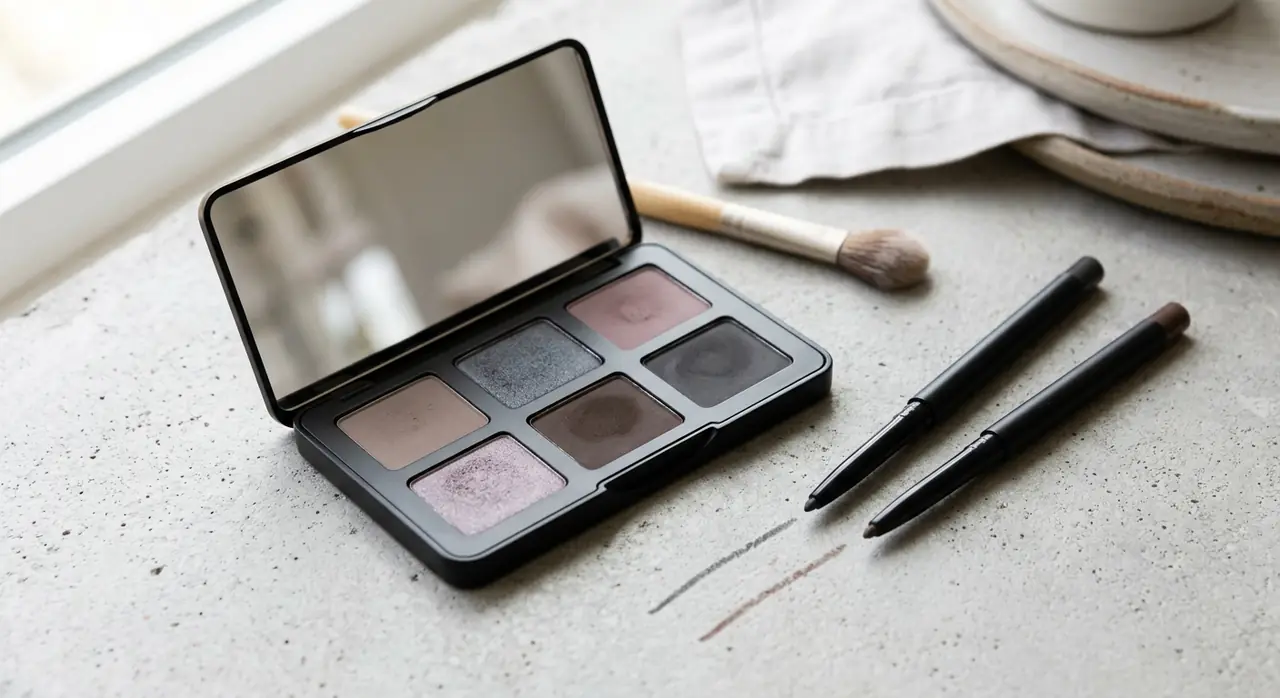
- Eyes: Standard "earth tones" (warm browns, bronzes, and coppers) are often a disaster, making your eyes look swollen or tired. Instead, opt for cool taupe, slate grey, or soft mauve eyeshadows. And remember to swap that harsh black liquid eyeliner for a softer charcoal or cool brown.
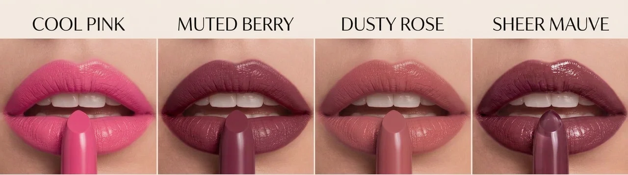
- Lips: Say goodbye to brick red, terracotta, and warm coral. When shopping for the perfect light summer color palette lipstick, your holy grails will always be cool pink, muted berry, dusty rose, and sheer mauve. These shades will bring a natural, healthy flush to your complexion rather than turning grey or looking pasted on.
Finding the Light Summer Color Palette Best Hair Color
When it comes to light summer color palette hair, the golden rule is to completely avoid brassiness. Any red, orange, or golden/yellow undertones will immediately clash with your skin, making you look tired.
You need colors that are low-contrast, soft, and distinctly cool. If you are heading to the salon to find the light summer color palette best hair color, ask your stylist for shades like an ashy blonde, a cool mushroom brown, or a soft icy brunette. Remember, the goal is harmony—avoid harsh, high-contrast colors like stark platinum blonde or jet black.
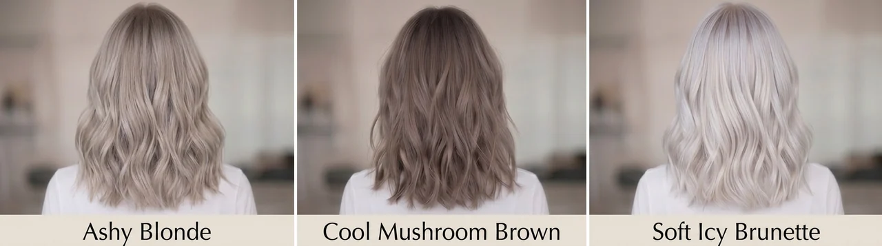
Thinking about going ashy blonde but terrified of a salon disaster? Or maybe you're staring at a mauve lipstick at the store, wondering if it'll actually look good on you?
Don't stress it! Just snap a quick selfie and drop it into our Makeup Generator and Hair Color Changer. Let's play around with a few shades together and find your absolute perfect match before you even book a salon appointment.
Adapting the Light Summer Seasonal Palette for Global Aesthetics
Modern seasonal color analysis was popularized in Western countries, and early versions were primarily tested and described using mostly European populations, which has led to critiques about limited representation and difficulty applying the system universally. Let's take a closer look at how these softer, more nuanced color palettes can be interpreted across diverse Asian skin tones, and how they fit into today's more inclusive, globally expanded approach to color analysis.
Decoding the Light Summer Color Palette Asian Features
One of the biggest roadblocks in global color analysis is the profound misconception surrounding Asian skin tones: the myth that "pale equals cool" and "yellow equals warm."
If you are researching light summer color palette asian guidelines, you must understand the critical difference between your overtone (the surface color of your skin) and your undertone (the shadow beneath it). Many Asian individuals have a distinctly yellow or olive overtone, leading them to falsely assume they are a warm Autumn or Spring.
Here is the specific reality check:
If you have a yellow overtone but a cool undertone, wearing warm colors like mustard, camel, or brick red will merge with your surface yellow, making you look severely sallow, tired, or literally "jaundiced."
Conversely, when you wear a soft lavender, powder blue, or cool pink, these cool tones neutralize the yellow overtone. The result? Your skin suddenly looks clear, brightened, and remarkably translucent.
If icy pastels act as an "eraser" for your skin's dullness, you are a Light Summer, regardless of how "yellow" your surface skin appears.
K-Beauty and the Light Summer Color Palette Korean Trend
If you are struggling to find makeup and clothing that fits your soft, cool profile in Western stores, you need to look East. The entire foundation of the light summer color palette korean aesthetic is practically built for your season. But what exactly makes Korean styling so perfect for you? It comes down to their distinct approach to contrast, texture, and color formulation.
- The Characteristics of K-Fashion for Light Summers:
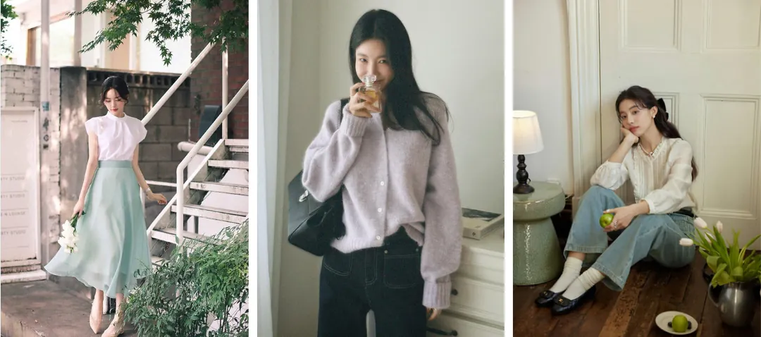
Western fashion often relies on sharp tailoring, heavy fabrics (like stiff leather or rigid denim), and high-contrast color blocking. K-Fashion, particularly the "Korean clean girl" and Balletcore trends, takes the opposite approach, which perfectly aligns with your delicate features:
- Low-Contrast Tonal Dressing: Korean styling excels at pairing colors with similar lightness. Instead of a jarring black-and-white outfit, they will pair an icy-blue oversized button-down with charcoal pleated trousers. This maintains the low-contrast harmony your season requires.
- Soft, Airy Textures: The aesthetic heavily utilizes sheer chiffons, soft mohair cardigans, and matte cottons. These "airy" fabrics visually mimic the high-value (light) and low-chroma (soft) nature of your color palette, making you look effortlessly expensive rather than overwhelmed by heavy materials.
- The Characteristics of K-Beauty for Light Summers:
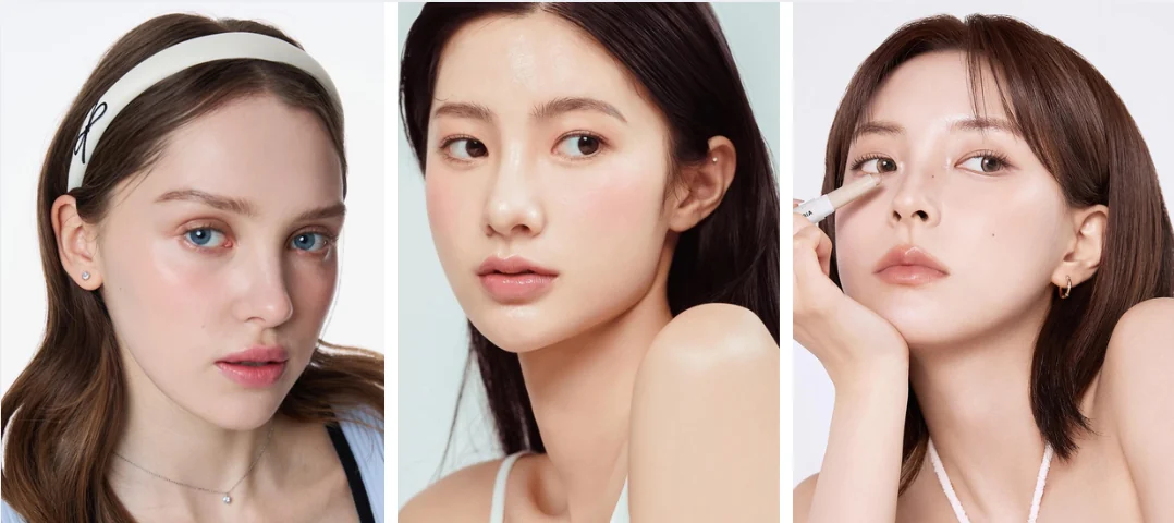
Western makeup traditionally emphasizes opaque, full-coverage products, harsh lip liners, and warm bronzers. For a Light Summer, this instantly creates a "painted-on" or muddy look. K-Beauty solves this through specific techniques:
- Watercolor Textures: Korean blushes and eyeshadows are formulated as sheer, buildable washes of color rather than highly pigmented powders. This allows your natural skin to show through, ensuring cool pinks and lavenders look like a natural flush rather than sitting heavily on the skin.
- Blurred Edges over Sharp Lines: Instead of a sharp, opaque liquid lipstick, K-Beauty favors the "blurred lip" technique using cool mauve or muted berry lip tints. Softening the edges of the lips and eyes perfectly complements your season's muted (soft) chroma.
- Grey-Based Contour (No Bronzer!): Korean makeup completely rejects warm, orange-toned bronzers. Instead, they use cool, grey-brown contour powders specifically designed to mimic actual shadows on the face, which is the only way a Light Summer can sculpt their face without looking dirty.
Light Summer Color Palette Celebrities to Inspire Your Style
Sometimes, the best way to understand the true potential of your season is to see it in action. If you ever feel like your colors lack impact or presence, looking at how light summer color palette celebrities style themselves for the red carpet will completely change your perspective.
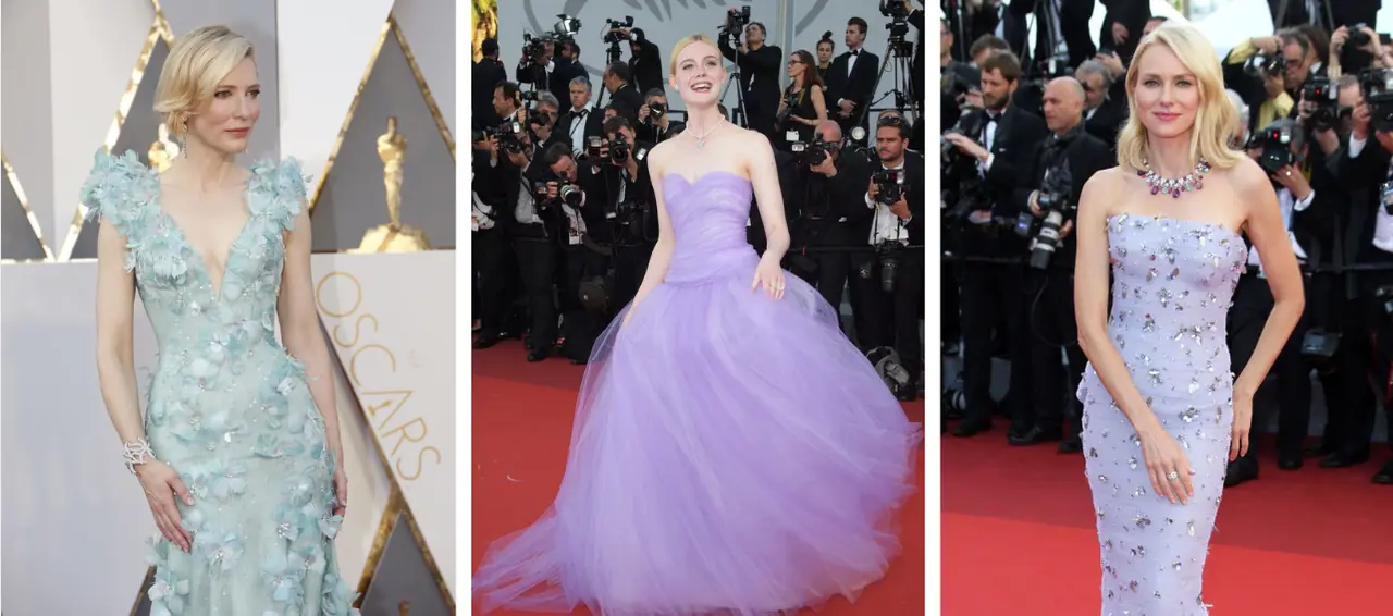
As seen in the iconic moments above, these Hollywood stars perfectly demonstrate how to use low-contrast, cool tones to achieve incredibly different, yet equally breathtaking, aesthetics:
- Cate Blanchett (Textured Elegance): Cate proves that Light Summers can command a red carpet without ever relying on heavy, dark colors. In her stunning icy seafoam green gown, she demonstrates a brilliant styling hack: because her colors lack high contrast, she uses intricate 3D floral appliques to create visual depth and texture. It shows exactly how cool, muted pastels can look incredibly expensive, sculptural, and captivating.
- Elle Fanning (The Ethereal Princess): Elle embraces the soft, romantic potential of this season flawlessly. In her breathtaking soft lavender tulle ballgown, she demonstrates the true power of "airy" fabrics. Because the Light Summer palette is so delicate and high-value (light), she can pull off massive volume and dramatic silhouettes without the dress overwhelming her natural beauty.
- Naomi Watts (Refined Glamour): Naomi shows us exactly how to execute high-end glamour within this season. Wearing a beautifully structured pale lilac dress adorned with icy silver embellishments, she perfectly harmonizes her outfit with her cool blonde hair. Pay close attention to her details: instead of a harsh, warm red lip, she opts for a bright cool-pink/berry lip and a statement necklace with matching cool-toned stones. She proves that Light Summers can absolutely wear a bold "pop of color" as long as the undertone stays strictly cool.
Mastering Your Light Summer Color Palette
Remember: your seasonal palette is an optimization tool, not an identity restriction. You don't have to abandon your personal style. Love a "wrong" color like black? Simply wear it away from your face, or use an icy-blue scarf as a buffer. Mastering the light summer color palette isn't about strict rules—it's about using color mechanics to look harmonious, radiant, and undeniably yourself.
✨Curious to see these colors on yourself?
Knowing your palette is a great first step, but applying it to real life should be easy. Explore our AI Color Analysis Tool to get a custom breakdown of your season, and use the virtual try-on features to see exactly how different outfits, hair colors, and makeup look.